Tuesday, 3 February 2015

Simply Cards & Papercraft 132

Well, I'm still in the process of catching up on sharing my published work with you - issue 33 has hit the shelves (and I have some cards featured inside! More on that at a later date), so I'm now only an issue behind.

I made these projects way back last year and was asked to create masculine birthday cards using a colourful corrugated mat stack by DCWV. This mat stack has seen a lot of use since, especially the natural brown colour, it's amazing how much use I get from it! The recycled/kraft look fits my style pretty well, and I love the texture it gives to a project.

I added a distressed effect to the mat in the card above by tearing around the top-left and bottom-right edges, then used white acrylic paint and a mask to dry-brush the polka dot pattern across the card front (yes, back in my dry-brushing days!).

For this card, I also used the dry-brushing technique to highlight the star hand-cut from red corrugated card. I kept the design fairly simple as masculine cards tend not to be too fussy, but a die-cut border and some extra cream polka dots finished it off.

Stars are always great for masculine cards, but you also can't go wrong with circles! I decided to use the mat stack to create some textured circles, which I layered up along with stickers, enamel dots and paper circles. This type of material isn't something you can die-cut particularly well, but I managed to use my scalloped circle punch for the blue circle, and of course using templates to hand-cut your own shapes from this thick material is always a must.

As always, I haven't shown all the cards featured in the magazine, so make sure you grab a copy to see the rest of my designs! That's it for now, back soon :)

Saturday, 31 January 2015

New Baby vintage frame

Hello again lovelies! Just dropping in on this cold Saturday night to share with you a recent project made for a friend to give as a gift for some new parents.

Apologies for the quality of the photographs - despite my (amazing) new camera (a Christmas present off my lovely husband) I completely forgot to photograph this project until 10 minutes before my friend came to collect it! So, these were taken at about 6pm on my dining room table with nothing but the living room light to illuminate it - and of course I had a cheeky 2-year-old around my feet too!

I have my clever friend to credit for the sweet message inside the frame. She specified exactly what she wanted to say, and I was allowed free reign to decorate it. I used a Traveling Typewriter font and printed it onto some cream American Crafts lined patterned cardstock for a vintage finish, then used the new Docrafts Bellissima range to decorate - the balloon caught my eye and was exactly the look I wanted - I especially love the silver gilt effect on the die-cuts.

I created my own hand-cut bunting using patterned paper and silver cord. I also fussy-cut a cloud from patterned paper and die-cut a second cloud from Authentique Renew cardstock. I have enough supplied left to create a second identical frame, ready for another new arrival. I just hope the new parents like it! :)

Wednesday, 28 January 2015

New beginnings

I've been meaning to blog this card since before Christmas - I made it a while ago for my lovely cousin and her family when they moved house. It uses some old American Crafts 5th & Frolic papers and some slightly newer Waltzingmouse Gift It stamps (which, by the way, I absolutely LOVE and I've used in a recent commission). It seems fitting to be sharing it right now, as I've got so many things in the pipeline at the moment - 2015 is proving to be a very exciting year full of new beginnings! I've been looking at nurseries for Stanley and have registered him at a perfect setting 10 minutes away, meaning I can increase my working week by a day. Plus I have so many ideas for projects, blog posts and designs, as well as an incredibly exciting job opportunity that's still in the early stages. Lots going on! Watch this space :)

Monday, 26 January 2015

Simply Cards & Papercraft 131

Well I did say I was behind on showing you my published work, so I thought I should catch up! I absolutely love making my own flower embellishments, so when I was asked to create some ribbon flower cards for issue 131 of Simply Cards & Papercraft I had such fun designing my projects. This issue is off sale now, but you might still find it on the website if you're quick. 

I used this technique for my 'Bloom & grow' shadow box tutorial and it's a really simple way of creating interesting flower embellishments, something I think the hot pink trim is particularly effective for.

Again, the technique used here is a fairly simple one but looks striking with a mixture of organza and silk hot pink ribbon. This card was actually a bonus card that appeared on the website - as you can't see it in the mag, I thought I'd share it here. The cute little Glitz Design owl matched my polka dot design perfectly and I think it really pops against the pink!

As well as ribbon flowers I was also asked to give some zipper flowers a try. Having never made them before, I found a really useful tutorial for this spiral flower on Pinterest, which basically involved stitching down the edge of half a zipper before tightening to create those pretty pleats.
The centre of the white zipper flower called for something bright, so this epoxy embellishment from my stash was just the job. I was really pleased with how it turned out!

The final card uses my favourite rolled rose technique to create these silk flowers. It's a fab technique to have in your crafting toolbelt, so I'm going to share a tutorial on how to make these very soon! That's it for now, have a great week :)


Friday, 16 January 2015

Case it!

It's time again for another Polka Doodles challenge, and this fortnight we're doing a Case It challenge, which basically involves choosing a project made by another team member and using it as inspiration for your card.

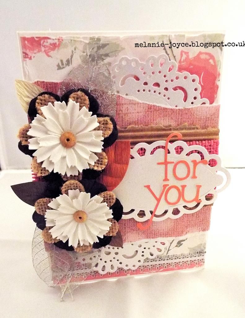
I chose the lovely Anna to case, I adore her layered style and gorgeous attention to detail. I tried to emulate the layout of her pretty card for the recycling challenge back in November, which used the Rose Budd collection in frosty tones of blue and lilac. For this card I went for a more springtime look and feel, using papers from the Picknix collection. I really enjoyed making it!
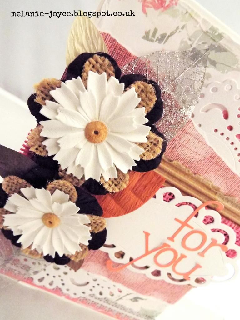
My mother-in-law picked up these flowers for me, from the Pound shop of all places! Aren't they beautiful? The on-trend burlap flowers hiding behind them are also a Pound shop find, while the paper and silver skeleton leaves are from my stash. 

The letter stickers are American Crafts, and I've also added some doily and matt die-cuts made from Die'sire dies and Centura Pearl cardstock.

The corrugated card and pink burlap scraps add to the eclectic, natural feel of the card. Mixing lots of different textures like this gives so much depth and interest. As someone who prefers the clean and simple look, this was a departure for me but I'm really pleased with the result! 

I'm going to be entering this card into the following challenges:

Tuesday, 13 January 2015

Scrapbook Magazine issue 86

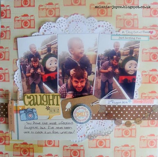
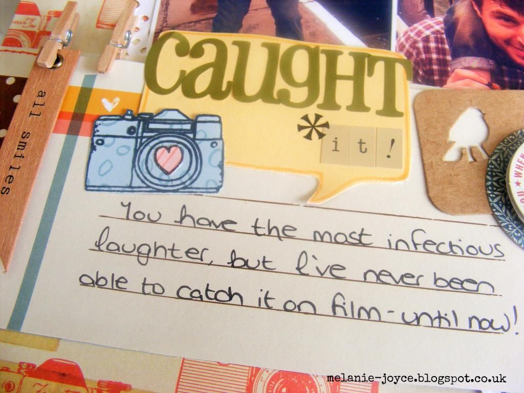
Well I'm waaaaay behind with showing you my published work - Scrapbook Magazine arrived on my doormat before Christmas! Luckily it's a bi-monthly title, so if you're quick you might just still catch it! I made one layout for this issue, with a small feature on how to capture emotions on your pages.

This one is from A Day Out With Thomas back in August, when my little pud had a whale of a time on his daddy's shoulders, hanging out with his grandparents and meeting his favourite train Thomas.
Of course as I'm sure you've probably guessed, the focus of this page is Laughter. I don't think there's a better sound in the world than the sound of my little guy giggling, especially when he's laughing at me being silly. I just love this age for that reason - toddlers are just so inherently happy aren't they!
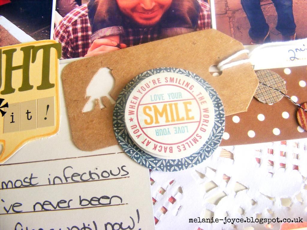
I wrote a little bit about how I'd finally been able to capture Stanley's laughter. Journaling cards aren't something I usually use on my pages, although I'm not sure why. It's probably a combination of not particularly liking my own handwriting, and wanting to fill available space with pretty embellishments rather than text.

I think with Stanley pages I'm going to have to add a little more detail in the future, to remember all these fleeting little phases of his life. So, another page to add to his album :)

Monday, 5 January 2015

Happy New Year!

We had a fabulous Christmas and New Year celebration and I hope you all did too!

Now things are getting back to normal I'm looking towards what I want to achieve in 2015 and, inspired and encouraged by the amazing Facebook group Embrace Happy, I've picked a word for the year that will help drive me on - Focus.
It can be applied to so many different things, and the largest part of this will be to try to gain balance and refocus my energies on the most important people in my life rather than wasting time on negativity. 

I'm also still establishing myself in the freelance world, so moving up a gear with my design work is of huge importance and as part of this I will also be applying more focus to this blog.

I hope it will become somewhere I can share not just my design work but my day-to-day life as a WAHM (working-at-home mum!) and all the creative whims I indulge along the way. I can't wait to get started!

Related Posts Plugin for WordPress, Blogger...