Hello lovely people - today's post is actually a Design Team submission for May Arts ribbon! When I saw these guys were looking for new designers I was thrilled. I know I use a hell of a lot of twine and embroidery thread on my projects, and the reason for this is because it's cheap and plentiful! I LOVE ribbon (particularly lace ribbon), but quite often I don't use it because it's far too pretty and I just want to hoard it away... what a refreshing change it's made to actually make myself use some of my lovely ribbon! And I must say, I really enjoyed making these projects.
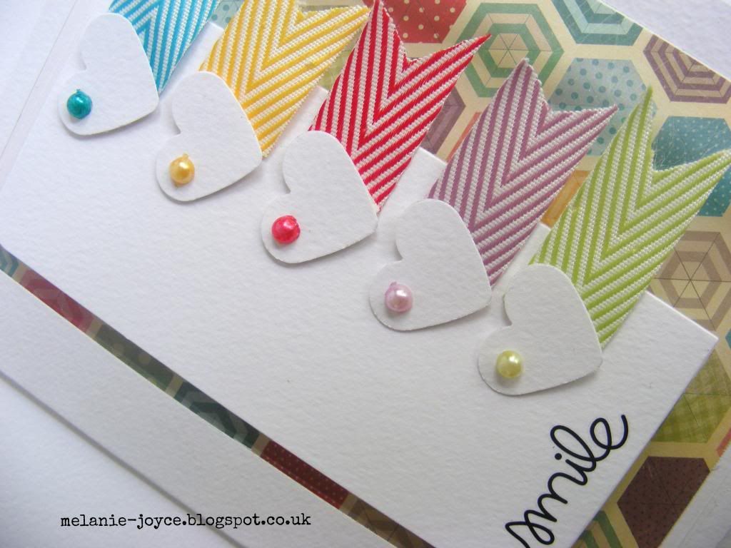
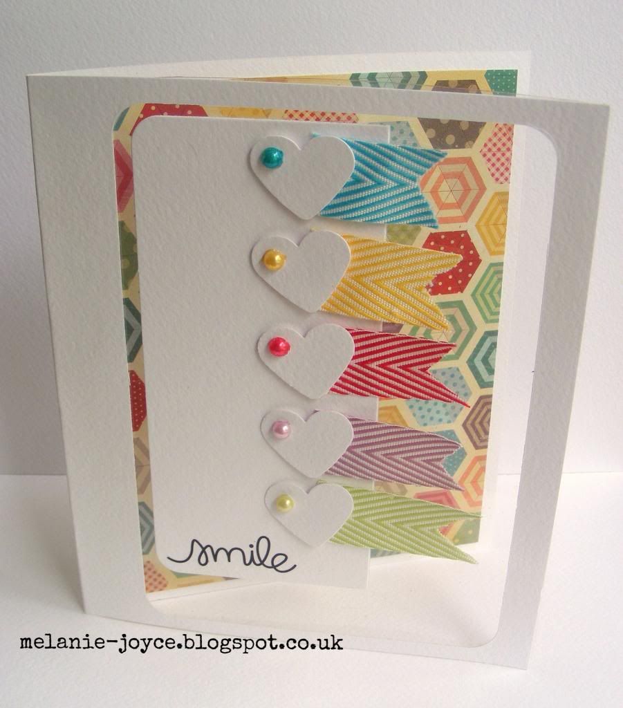
To start with, I die-cut a panel from white watercolour cardstock, then scored, folded and trimmed to make my card blank. I backed the die-cut aperture with clear acetate and attached some Crate Paper The Pier patterned paper to the inside of the card, to show through. The pieces of May Arts Chevron Stripes ribbon were trimmed into pennant shapes and attached to punched hearts, then attached down the edge of a second die-cut panel. For an extra touch, I coloured some white pearls using my Crafter's Companion Spectrum Noir pens to match each shade of ribbon. I'm loving the bright, clean and simple look at the moment, it's what I'm all about! More to come tomorrow :)
Friday, 6 June 2014
Tuesday, 3 June 2014
Scrapbook Magazine issue 81
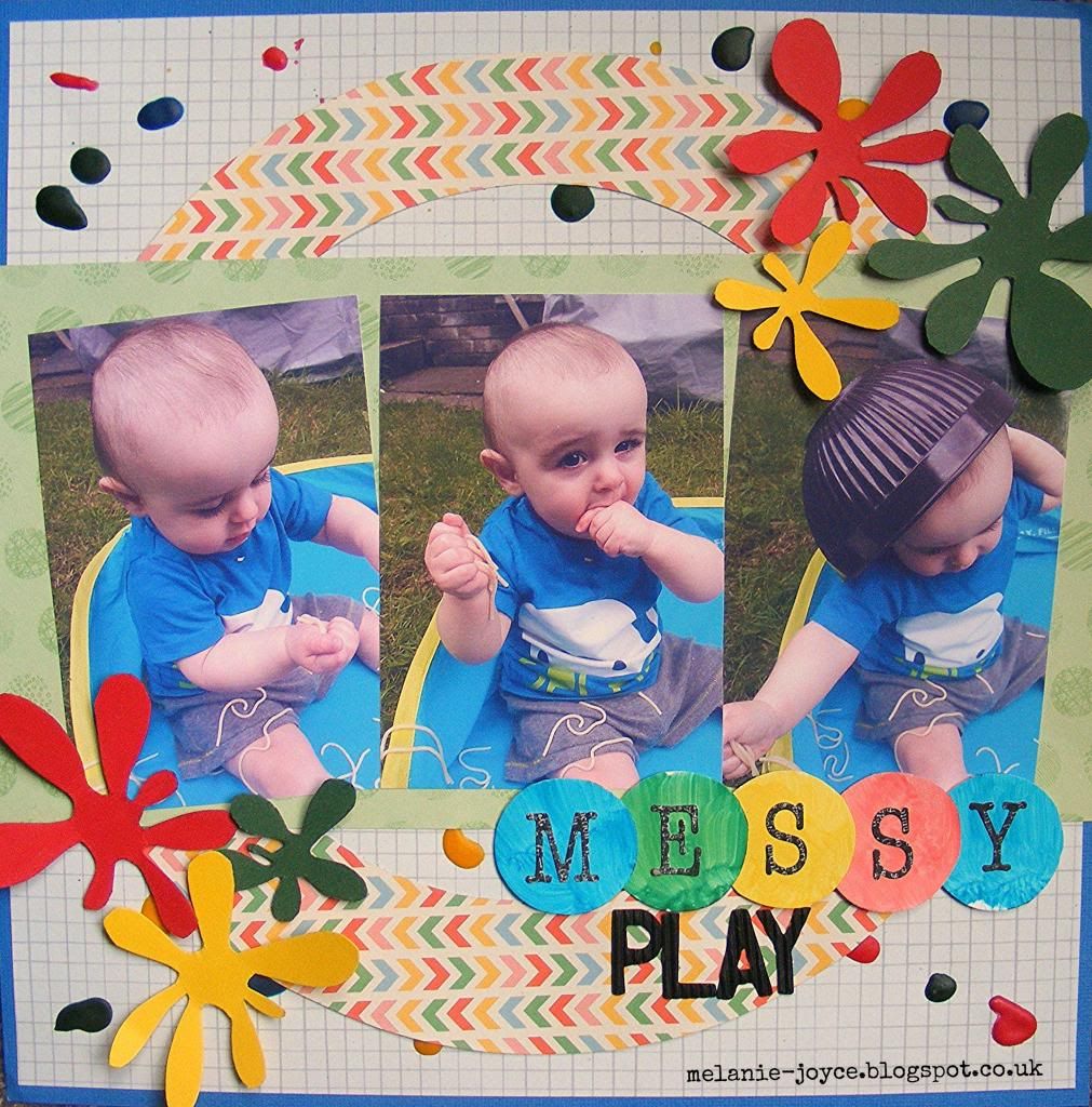
Just a quick post today to show you the layout I made for issue 81 of Scrapbook Magazine. It's for the sketch challenge, and for this particular layout I stuck very closely to the original sketch rather than playing around with the structure. I added dimension by dropping red, green, blue and yellow acrylic paint onto a light background paper, something I'd never tried before. I think next time I might use my heat gun to create a more splattered effect. I didn't bother with any readymade embellishments, as the design of the layout and the large photos didn't need it, but I added some DIY touches with hand-drawn paint splats. The 'Messy' letters were made by painting onto scraps of glossy photo paper and punching into circles, before adding black letter stickers. Thickers are great and so, so useful, but there's nothing quite like creating your own co-ordinating titles!
This issue also comes with a beautiful My Mind's Eye paper pack, which I'm sure will be popping up on one of my layouts soon. Make sure you get hold of your copy now! Have a great week :)
Thursday, 29 May 2014
Neon kids' card
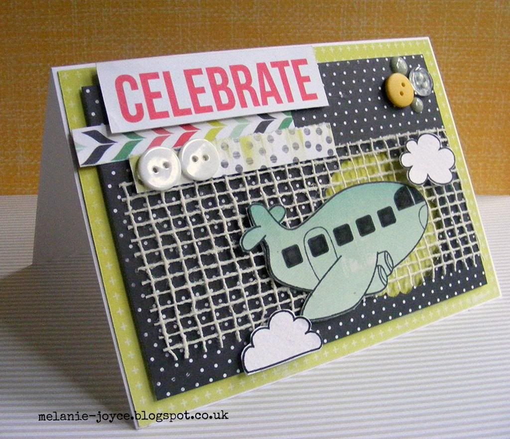
It's been a bleary-eyed kind of few weeks in our household lately. As I write this my eyes are so sore and I've got my coffee on standby - Stanley is having another sleep regression and it is killing me! Even he seems to be tired and fed up today, so I know it's affecting both of us. We took the sides off his cot and he will now fall asleep IN the bed, without being rocked (yay for small victories!), but he still wakes up at least once (or like last night, several times) a night. I really hope this new phase is over soon! In the meantime, I've been busy with more deadlines for magazine commissions, so no rest for the wicked! Lucky for you, I managed to sneak an extra card into my working day and create this new project.
My last commission called for kids' cards with a pop of neon, and this card uses a lot of the same products that I used - Glitz Design papers, DigiStamp Boutique digital stamps and Simple Stories Sn@p cards - but minus the highlighter pen! It may be hard to envisage, but of course I will share the cards with you once the magazine hits the shelves. I was pleased with the results and I hope you'll like them too!
Friday, 23 May 2014
Creative Cardmaking magazine issue 67
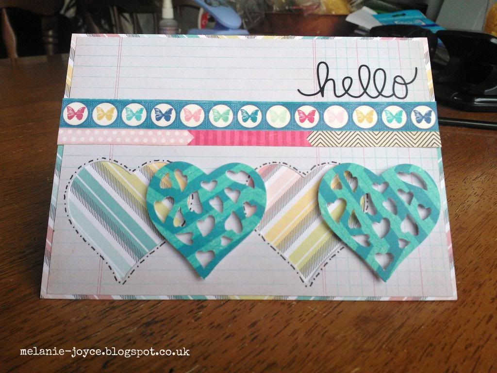
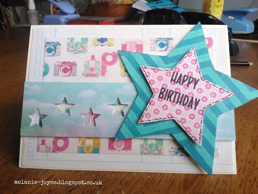
Just a quick one today as I've been getting back to speed after our few days away and putting the finishing touches to a magazine commission. I just wanted to show you some of the cards I made for Creative Cardmaking magazine issue 67 a few weeks back. This issue is on sale now and my cards even made the cover - yay! The photos aren't great I'm afraid as I was using my cameraphone. The brief was for 'reverse' punching, using the negatives from punched shapes to create feminine birthday cards and I was really pleased with how they turned out. There are two more in the magazine, but I wouldn't want to give everything away now would I? ;) Take a peek at the magazine for more!
Sunday, 18 May 2014
Greetings from Essex
We're down in Essex for a few days to visit my dad, staying in a nice big static caravan on a lovely quiet site. The weather has been amazing and Stanley is enjoying his first time in a big boy bed - in fact, I think we'll take the sides off his cotbed when we get home. He's growing up so quickly! That's it from me - normal service resumes next week!
Monday, 12 May 2014
Ornate frame card
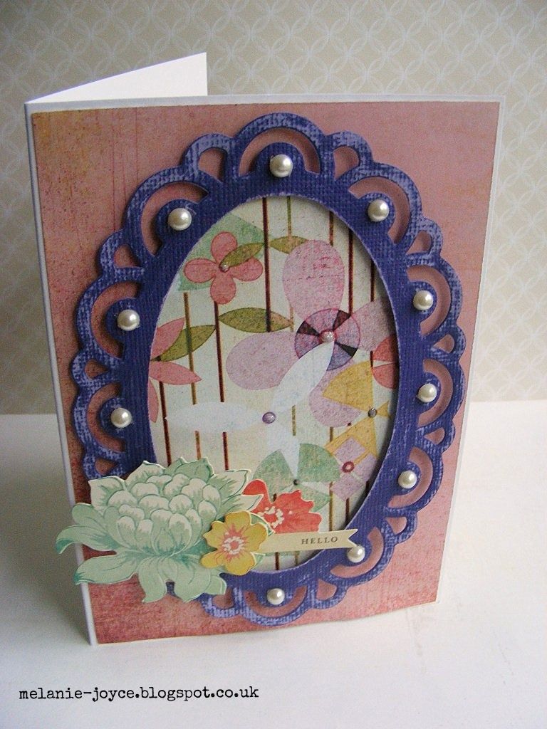
I can't believe for all this time I've resisted die-cutting machines. They were too costly, too cumbersome, and anyway my number one purchase was just always pretty patterned paper. But since getting my ebosser, dies and embossing folders, I've been having great fun experimenting and trying new things. Mainly I have been playing with the folders, but for this card I thought I would try something a little different with a stamping frame die. This is another design that just seemed to pop into my head. I had already die-cut the purple frame when making a different card, and discarded it as it was the wrong colour. Being me, I decided I just had to use it in a card and this design immediately formulated.
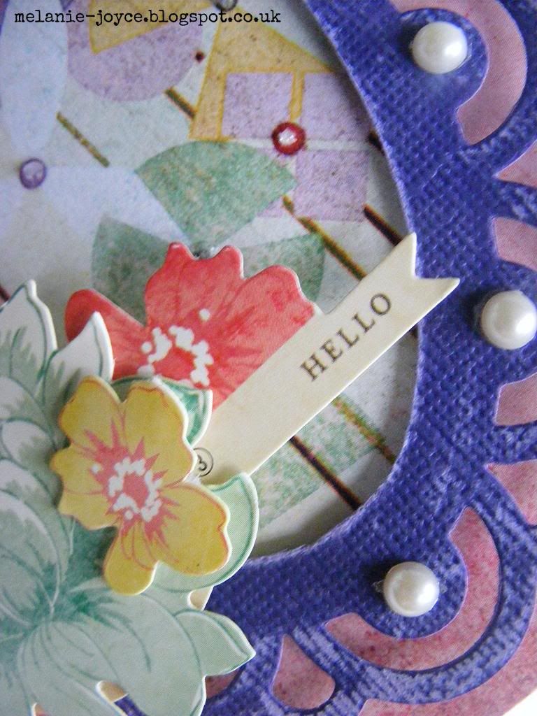
Frames like this are used so often for stamped images, but I liked the idea of mounting a purple and lilac patterned paper behind the frame. Scarily, a look through my scraps box only uncovered these old BasicGrey papers - I have no other lilac papers in my stash! And seen as I LOVE purple, I think a splurge is in order ;) The frame was cut from Core'dinations cardstock, so I sanded it for a shabby chic effect, then added a Crate Paper dimensional sticker and some pearls to finish. Simple yet stylish. I hope you like it!
Thursday, 8 May 2014
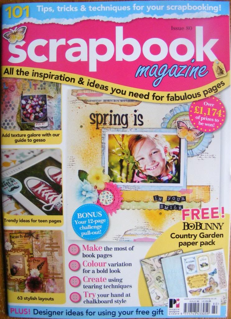
Scrapbook Magazine issue 80
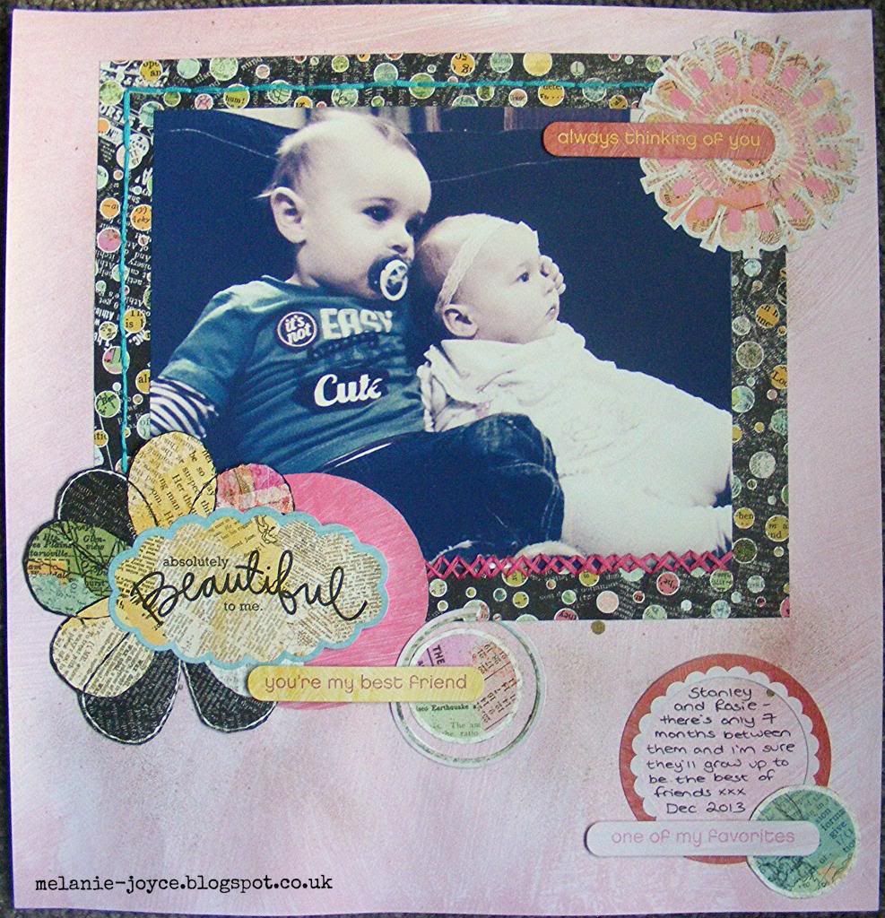
Hello on this rainy Thursday :) It's a late one as I've just been sooooo busy today, but thankfully I'm ticking lots off my to-do list. Today's post is a recent layout that was published in issue 80 of Scrapbook Magazine, and it's of Stanley and his little friend Rosie (my cousin's little girl). They joined us at the cottage in Anglesey last month and were so sweet together. Stanley was very gentle with her - proud mummy alert!
It's a really simple, pared-down design based on a sketch within the magazine. I left the focus on the huge photograph, with hand-stitching, stickers and a sparkly background paper to highlight, which I had spritzed with an Antique Gold Crafty Notions colour spray. The journaling reads 'Stanley and Rosie - there's only 7 months between them and I'm sure they'll grow up to be the best of friends xxx Dec 2013'. Watch out for more coming from Scrapbook Magazine soon!
Subscribe to:
Posts (Atom)