Friday 27 June 2014

Yay for demos!

Hello again! Where does the time go? It's been over a week since I last blogged and I hate leaving it so long. Next week I promise to be better! My work days so far have been spent at a computer doing a spot of freelance sub-editing, so I haven't been crafty aaaalllll week and wow am I missing it! But while I had a chance I thought I would show you some more samples made for last week's Crafter's Companion demo. I had a fantastic time on the day and it was great to meet so many lovely ladies, many of whom stayed all day to watch me demonstrate.
These cards were made using the brand-new Vintage Floral collection, which includes a 6x6" paper stack, embossing folders, stamps and a CD-ROM full of digital goodies to print out. The customers at Crafty Ladies in Marple particularly loved the Vintage Words folder used on the bottom card, which I then sanded with a Core'dinations sanding block to highlight.
These second cards showcase both the Angelica & Adam stamps and patterned papers and the new Spectrum Noir pencils. I kept the designs of the cards fairly simple so the emphasis was on the images themselves. I don't normally consider myself to be much of a stamper and colour-inner, but I actully got the hang of the pencils quite quickly and enjoyed using them, particularly on kraft cardstock. Oh, and as a side note, the seam binding on the first card was actually white and I coloured it pink using my Spectrum Noir markers - I LOVE being able to alter embellishments to suit my projects, it's probably my favourite thing about the markers. That's it from me for tonight, I'll be back soon with some very exciting news!

Friday 20 June 2014

Fanciful florals

Hello again! Just a quick post to share what I've been up to this week. On Saturday I'll be demonstrating for Crafter's Companion at Crafty Ladies in Marple, Stockport. I popped by the shop on Monday and spoke to one of the owners, Pauline, who was lovely and I'm sure I'm going to have a fantastic time. We'll be taking a closer look at the Angelica & Adam range and colouring with the Spectrum Noir pens and new pencils, playing with the brand-new Vintage Floral collection (including the yummy 8x8" and A4 embossing folders) and I'll be recreating these lacy floral cards using the new Die'sire Quilling dies and Create a Card designs. If you're in the area do come along and take a look! I'll post some more cards and demo pics next week and let you know how I got on. Have a great weekend :)

Wednesday 11 June 2014

Simply Cards & Papercraft issue 124

Hello lovelies! I'm back with some more cards tonight. This time they're projects that were featured in the Cardmaker's Challenge in the latest issue of Simply Cards & Papercraft, and the brief was to incorporate feathers into my designs. My first thought was this fab greyscale feather-patterned digital paper from American Crafts. It's so striking and looks amazing teamed with hot pink cardstock.
I also used my Die'sire Embossalicious Clouds embossing folder for the first time - it's quite possibly my favourite at the moment. As well as embossing the hot pink cardstock, I also embossed a scrap piece of patterned paper and cut out two of the clouds to make these embellishments. I was really pleased with the finished effect!
The second card uses an actual Marabu feather as its focal point. I didn't have any hat stamps of the right size, so I opted to hand-cut a hat shape from polka dot patterned paper instead.
I finished it off with a stamped sentiment, a lace trim, pink flowers and a pretty pink pearl. Two very girly cards, which feels like a bit of a departure from the last few commissions I've done lately. I do hope you like them :)

Monday 9 June 2014

You Are So Loved - May Arts DT submission part 3

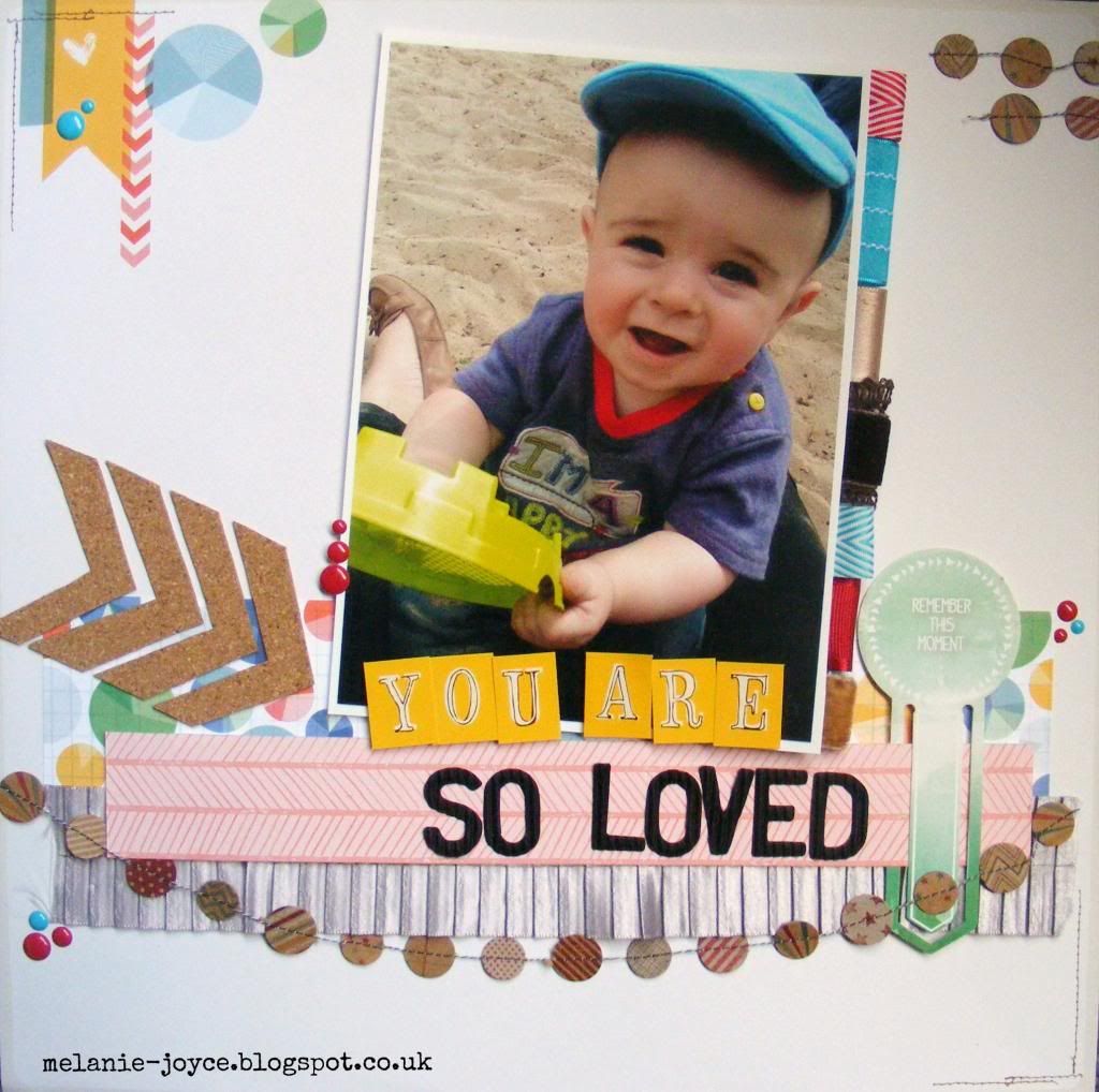
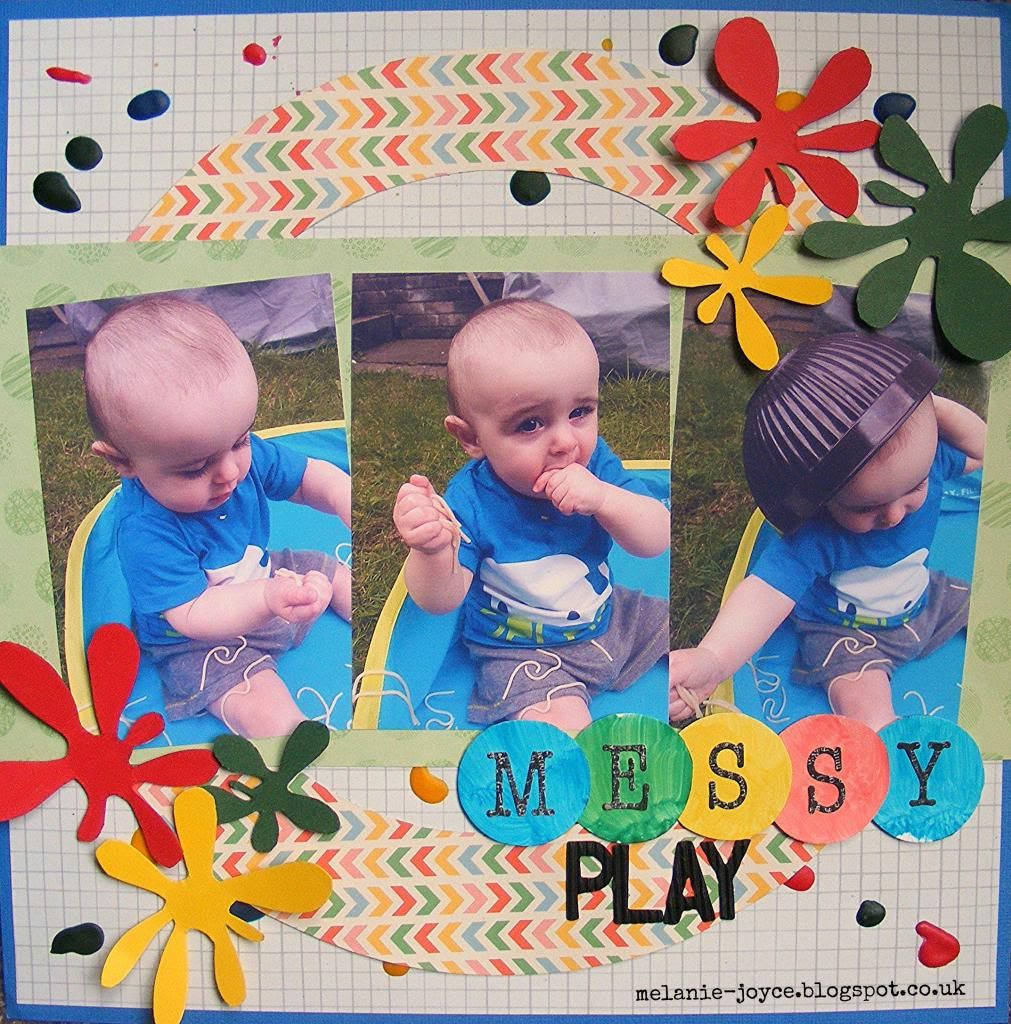
Hello again! Here is my final project for the May Arts Design Team call, and it just had to be a scrapbook layout. I predominantly make cards (as mostly I get commissioned for cards), but I adore scrapbooking, especially since my little pud came along. Any chance I have to scrapbook, I take it!
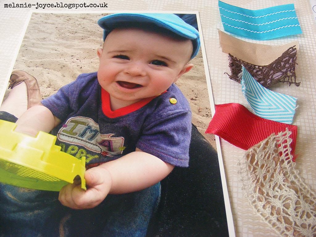
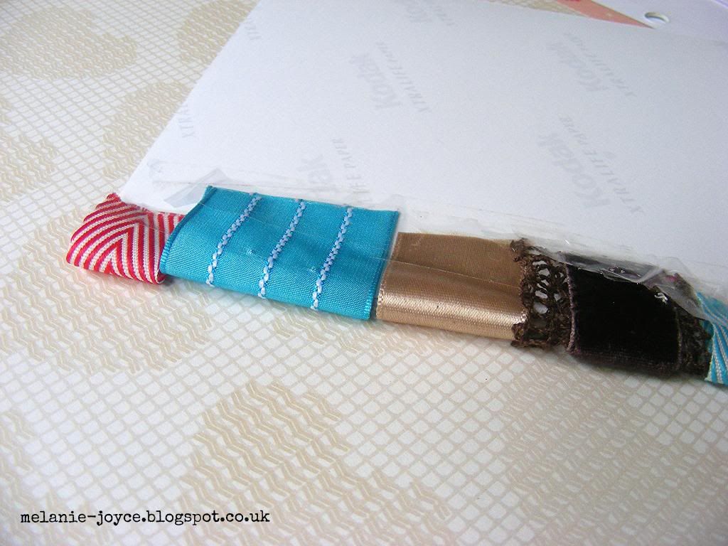
To begin with, I made the ribbon tabs for the right-hand edge of my photograph. I cut various pieces of May Arts ribbon to match the colours in the photograph, ensuring there was enough to fit down the whole length of the image.
I folded each piece of ribbon into a loop and secured them down the edge of the photograph with sticky tape - I find this provides a much more secure adhesion for this than glue or double-sided tape.
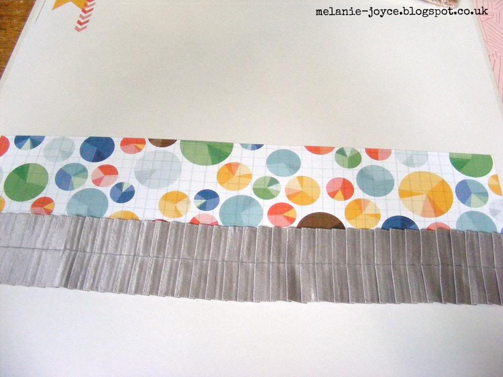
I trimmed a strip of American Crafts Amy Tangerine Ready Set Go On The Clock patterned paper and layered it across the centre of a Why Thank You 12x12" sheet. I then adhered a length of silk ruched ribbon across the bottom of the strip.
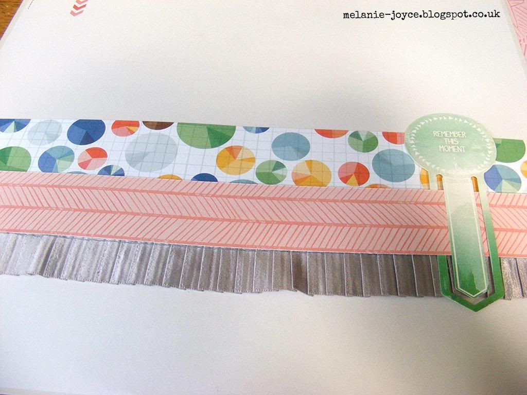
I trimmed a thinner strip from the reverse of the On The Clock patterned paper, then threaded a large Glitz Design Finnley die-cut clip onto the right-hand side.
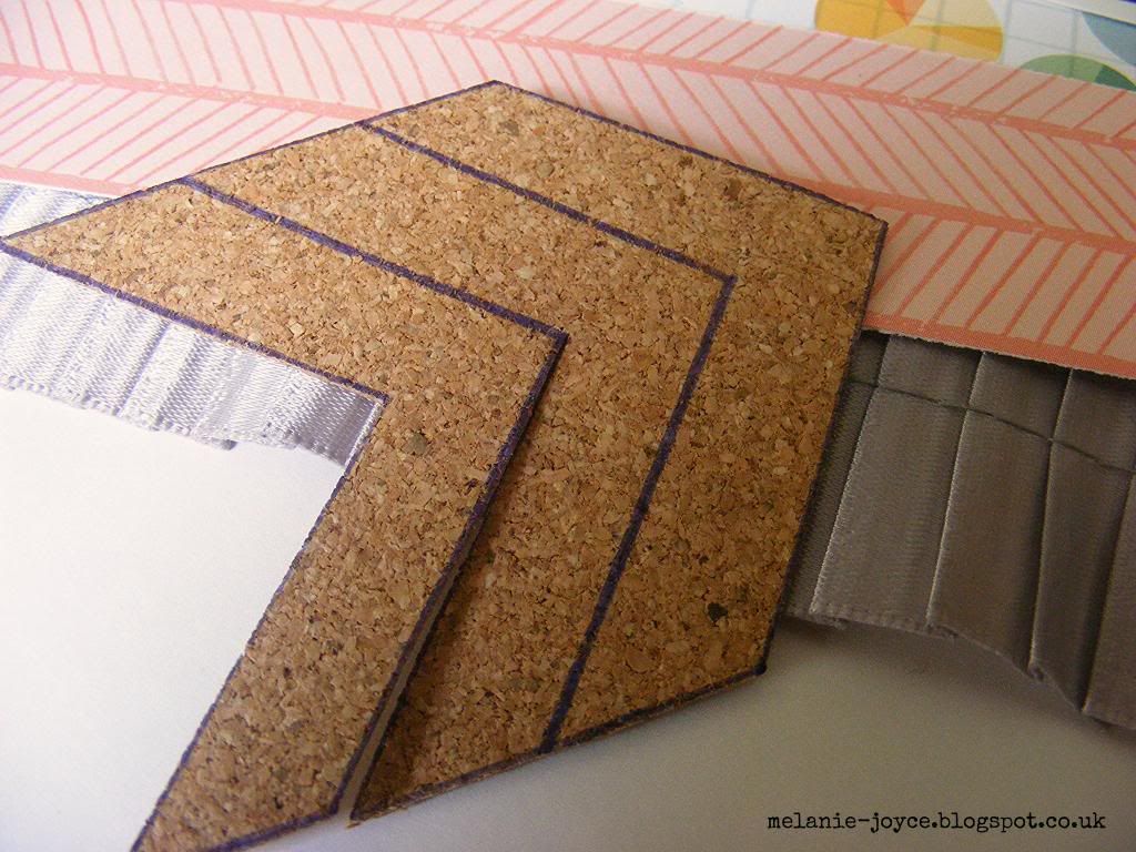
I used a ruler and pen to hand-draw chevron shapes onto a cork sheet, then carefully cut them out. These cork sheets from DCWV (Die Cuts With a View) are so versatile - I love using them to create my own embellishments!
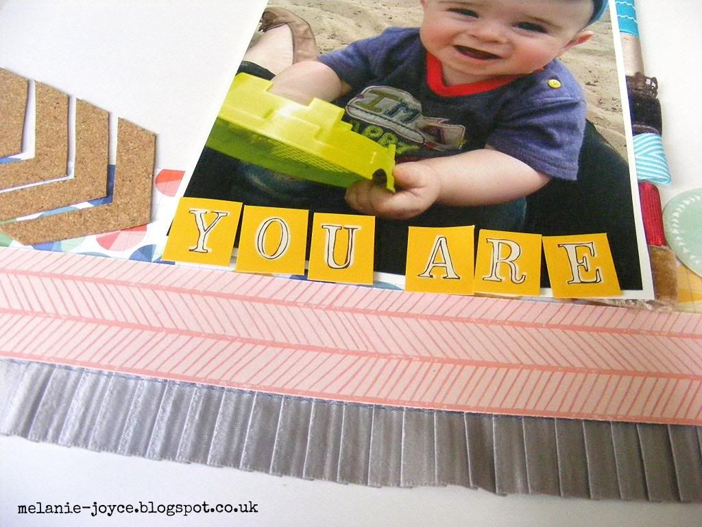
I mounted my ribbon tab photo onto the layout using 3D foam pads, then adhered the chevron shapes to the left-hand side. I added the first part of my title using Amy Tangerine stickers.
The title was finished with Amy Tangerine Ready Set Go corrugated Thickers, then I added a kraft garland from the My Mind's Eye Kraft Funday collection. I also attached a few strips of this to the top right-hand corner of the layout. To finish, I scattered red and blue Simple Stories enamel dots around the edges of the paper strips. I'm really happy with the way my layout turned out, and I so hope you like it. I had such fun designing these projects for May Arts - fingers crossed I'm successful!


Sunday 8 June 2014

Thank You ribbon panel - May Arts DT submission part 2

Hello everyone! Hope you're enjoying this good weather - we're having a family day. Tonight we're going for a meal to celebrate Stanley's great-grandma's 80th birthday, and this morning we went out and had a go on a miniature steam train with Stanley - he loved every minute of it! Now while he naps I'm back with another card for my May Arts Design Team submission. For this one I decided to create a ribbon panel, using various different textures, colours and widths of ribbon. I absolutely ADORE the glitter ribbon I've used here, and the photo doesn't show just how beauiful and sparkly it really is!

I wanted the ribbon to be the star of the show and could have left the panel how it was, but I thought it looked a little too plain and simple, so I added more dimension and texture by using a template to hand-cut these stars from a sheet of cork, then finished off with a sprinkling of sequins. Sequins are my new craft obsession - they make an eye-catching change from the usual pearls or gems, and they're cost-effective too! I think it's going to be a while before I'm over this particular obsession. That's all from me for now - back soon with part 3 :)

Friday 6 June 2014

Smile ribbon card - May Arts DT submission part 1

Hello lovely people - today's post is actually a Design Team submission for May Arts ribbon! When I saw these guys were looking for new designers I was thrilled. I know I use a hell of a lot of twine and embroidery thread on my projects, and the reason for this is because it's cheap and plentiful! I LOVE ribbon (particularly lace ribbon), but quite often I don't use it because it's far too pretty and I just want to hoard it away... what a refreshing change it's made to actually make myself use some of my lovely ribbon! And I must say, I really enjoyed making these projects.
To start with, I die-cut a panel from white watercolour cardstock, then scored, folded and trimmed to make my card blank. I backed the die-cut aperture with clear acetate and attached some Crate Paper The Pier patterned paper to the inside of the card, to show through. The pieces of May Arts Chevron Stripes ribbon were trimmed into pennant shapes and attached to punched hearts, then attached down the edge of a second die-cut panel. For an extra touch, I coloured some white pearls using my Crafter's Companion Spectrum Noir pens to match each shade of ribbon. I'm loving the bright, clean and simple look at the moment, it's what I'm all about! More to come tomorrow :)

Tuesday 3 June 2014

Scrapbook Magazine issue 81

Just a quick post today to show you the layout I made for issue 81 of Scrapbook Magazine. It's for the sketch challenge, and for this particular layout I stuck very closely to the original sketch rather than playing around with the structure. I added dimension by dropping red, green, blue and yellow acrylic paint onto a light background paper, something I'd never tried before. I think next time I might use my heat gun to create a more splattered effect. I didn't bother with any readymade embellishments, as the design of the layout and the large photos didn't need it, but I added some DIY touches with hand-drawn paint splats. The 'Messy' letters were made by painting onto scraps of glossy photo paper and punching into circles, before adding black letter stickers. Thickers are great and so, so useful, but there's nothing quite like creating your own co-ordinating titles!
This issue also comes with a beautiful My Mind's Eye paper pack, which I'm sure will be popping up on one of my layouts soon. Make sure you get hold of your copy now! Have a great week :)
Related Posts Plugin for WordPress, Blogger...